Bài viết gần đây
-
OPC trong hệ thống IB Bot: làm chủ điểm hòa vốn vận hành
Tháng 7 21, 2026 -
Buổi 19 IB Bot — Landing Page & Domain Setup Dưới 200k
Tháng 7 20, 2026
| Trực Quan Hóa Dữ Liệu Bằng Python (Data Visualization)
Được viết bởi thanhdt vào ngày 09/12/2025 lúc 19:03 | 211 lượt xem
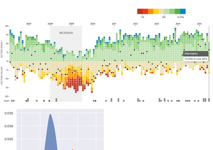
Trực Quan Hóa Dữ Liệu Bằng Python (Data Visualization)
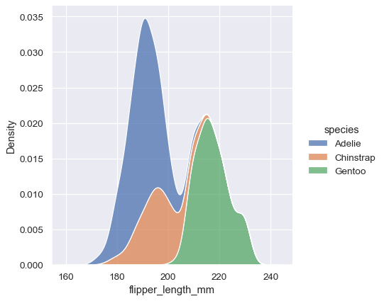

Trực quan hóa dữ liệu là bước quan trọng trong phân tích dữ liệu.
Một biểu đồ tốt giúp bạn:
- Hiểu xu hướng
- Nhìn thấy mối tương quan
- Phát hiện outliers
- Truyền tải insights nhanh hơn bảng số
Python có 3 thư viện mạnh nhất:
- Matplotlib – nền tảng cơ bản
- Seaborn – đẹp, trực quan
- Plotly – biểu đồ tương tác (interactive)
Bài này tập trung vào Matplotlib + Seaborn, phù hợp cho Data Analyst.
1. Chuẩn bị dữ liệu mẫu
import pandas as pd
import matplotlib.pyplot as plt
import seaborn as sns

df = pd.DataFrame({
    "month": ["Jan","Feb","Mar","Apr","May","Jun"],
    "revenue": [120,150,180,200,170,190],
    "cost": [30,50,40,60,45,55]
})
2. Line Chart – Biểu đồ xu hướng
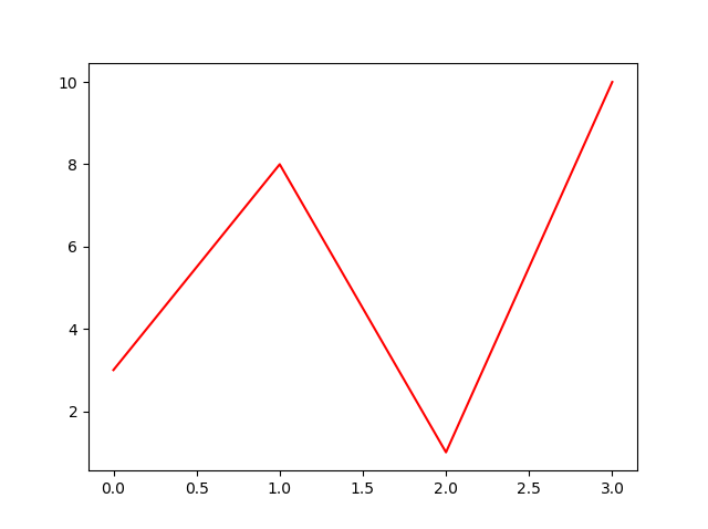
Doanh thu theo tháng:
plt.plot(df["month"], df["revenue"], marker="o")
plt.title("Revenue by Month")
plt.xlabel("Month")
plt.ylabel("Revenue")
plt.grid()
plt.show()
Dùng để:
- Hiểu xu hướng
- Dự đoán thay đổi theo thời gian
- So sánh nhiều dòng (multi-line)
3. Bar Chart – So sánh theo nhóm
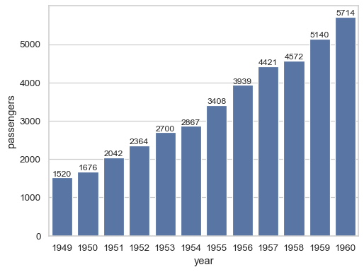

sns.barplot(x="month", y="revenue", data=df)
plt.title("Revenue by Month")
plt.show()
Ứng dụng:
- So sánh doanh thu theo tháng
- So sánh sản phẩm / chi phí / khách hàng
4. Grouped Bar Chart – So sánh nhiều chỉ số
import numpy as np

x = np.arange(len(df["month"]))
width = 0.35

plt.bar(x - width/2, df["revenue"], width, label="Revenue")
plt.bar(x + width/2, df["cost"], width, label="Cost")

plt.xticks(x, df["month"])
plt.legend()
plt.title("Revenue vs Cost")
plt.show()
5. Scatter Plot – Mối tương quan

sns.scatterplot(x="cost", y="revenue", data=df)
plt.title("Revenue vs Cost")
plt.show()
Dùng để xem:
- Mối quan hệ giữa 2 biến
- Xu hướng tuyến tính
- Outliers
6. Histogram – Phân phối dữ liệu
df["revenue"].plot(kind="hist", bins=10)
plt.title("Revenue Distribution")
plt.show()
Dùng để:
- Xem dữ liệu có lệch hay không
- Ước lượng mật độ phân phối
7. Boxplot – Phát hiện ngoại lai (Outliers)
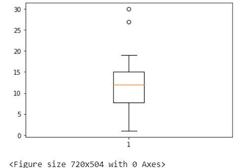
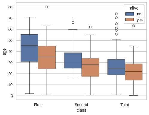
sns.boxplot(y=df["revenue"])
plt.title("Revenue Boxplot")
plt.show()
8. Heatmap – Ma trận tương quan
sns.heatmap(df.corr(), annot=True, cmap="coolwarm")
plt.title("Correlation Heatmap")
plt.show()
Dùng để:
- Xem biến nào liên quan đến biến nào
- Lọc biến mạnh/yếu trước khi mô hình hóa
9. Pie Chart – Biểu đồ tròn (giới hạn dùng)
sizes = df["revenue"]
labels = df["month"]

plt.pie(sizes, labels=labels, autopct="%1.1f%%")
plt.title("Revenue Share")
plt.show()
Lưu ý:
Không nên dùng khi dữ liệu > 5 nhóm.
10. Pairplot – Phân tích đa biến


sns.pairplot(df)
plt.show()
Dùng cho:
- Khám phá dữ liệu ban đầu
- Tìm mối liên hệ giữa nhiều biến
11. Plotly – Biểu đồ tương tác (tùy chọn nâng cao)
import plotly.express as px

fig = px.line(df, x="month", y="revenue", title="Revenue Trend")
fig.show()
Ứng dụng:
- Dashboard
- Báo cáo trực tuyến
- Trình bày trong doanh nghiệp
12. Kết luận
Trong bài 5 bạn đã biết cách tạo các biểu đồ quan trọng nhất:
- Line chart
- Bar chart & Grouped bar
- Scatter plot
- Histogram
- Boxplot
- Heatmap
- Pie chart
- Pairplot
- Plotly interactive chart
Trực quan hóa là bước quan trọng nhất để biến dữ liệu thành insights.
Biểu đồ tốt = Quyết định tốt.
✉️
Weekly Digest — Nhận Bản Tin Hàng Tuần
Nhận các bài viết phân tích kỹ thuật chuyên sâu, thuật toán giao dịch tự động (Trading Bot) và các giải pháp công nghệ mới nhất từ Hướng Nghiệp Dữ Liệu.

Thành ĐT
Founder & Chief Technology Officer, HNDL
1.325
Bài viết
15.4k
Người theo dõi
120k+
Lượt đọc
Chuyên gia với hơn 10 năm kinh nghiệm trong phát triển hệ thống giao dịch tự động (Trading Bot), Fintech, Mobile App và phân tích dữ liệu tài chính (Quantitative Analysis). Người sáng lập và trực tiếp dẫn dắt các khóa học thực chiến tại Hướng Nghiệp Dữ Liệu.